Section 7 Project: Create The Visual Design Language for Your Redesign

I got the idea of using style tiles from Samantha Warren.

What are Style Tiles?

Style Tiles are a design deliverable consisting of fonts, colors and interface elements that communicate the essence of a visual brand for the web.

They help form a common visual language between the designers and the stakeholders and provide a catalyst for discussions around the preferences and goals of the client.

Style tiles establish a direct connection with actual interface elements without defining layout.

I find Style Tiles are a great way to really begin thinking about designing the visual identity for the web. You don’t get stuck trying to design the homepage, or pick a font, or even a color. You get to see how everything works at a really high level and adjust it accordingly. Sure you still need to spend time picking out fonts and colors, but I find it a much quicker and smoother process when you can see how everything comes together.

The original Style Tiles can be downloaded as a psd, but I find that when I am trying to design for the web I want to spend more time designing in the browser. You can see how things work in real time, especially hover effects, something that can’t be demonstrated in static document.

For more information on Style Tiles check out Style Tiles – A visual Web Design Process for Clients and the Responsive Web or fork Jerad Gallinger – Style tiles with SCSS.

See the Pen Style tiles with SCSS by Ryan Conway (@conwayeast) on CodePen.0
See the full version on CodePen.

Section 3 Project: Design the User Interface (UI) for a Timebank from Intro to the Design of Everyday Things

Intro to the Design of Everyday Things

Objective

1. Page 1: Cover image of the design with name and title of assignment.

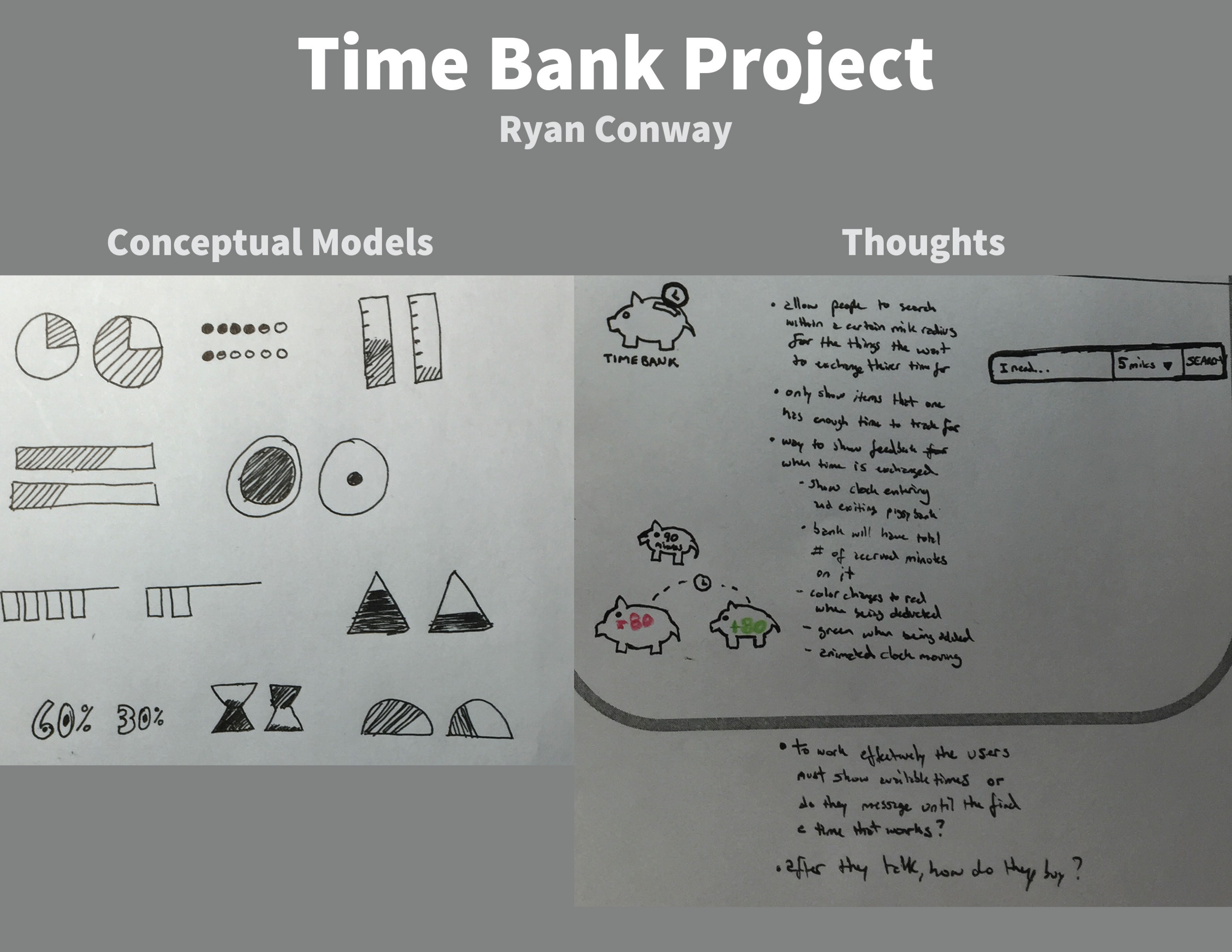
2. Page 2: Images and text to convey the conceptual models of “more”/”less” and “credit”/”debit”.

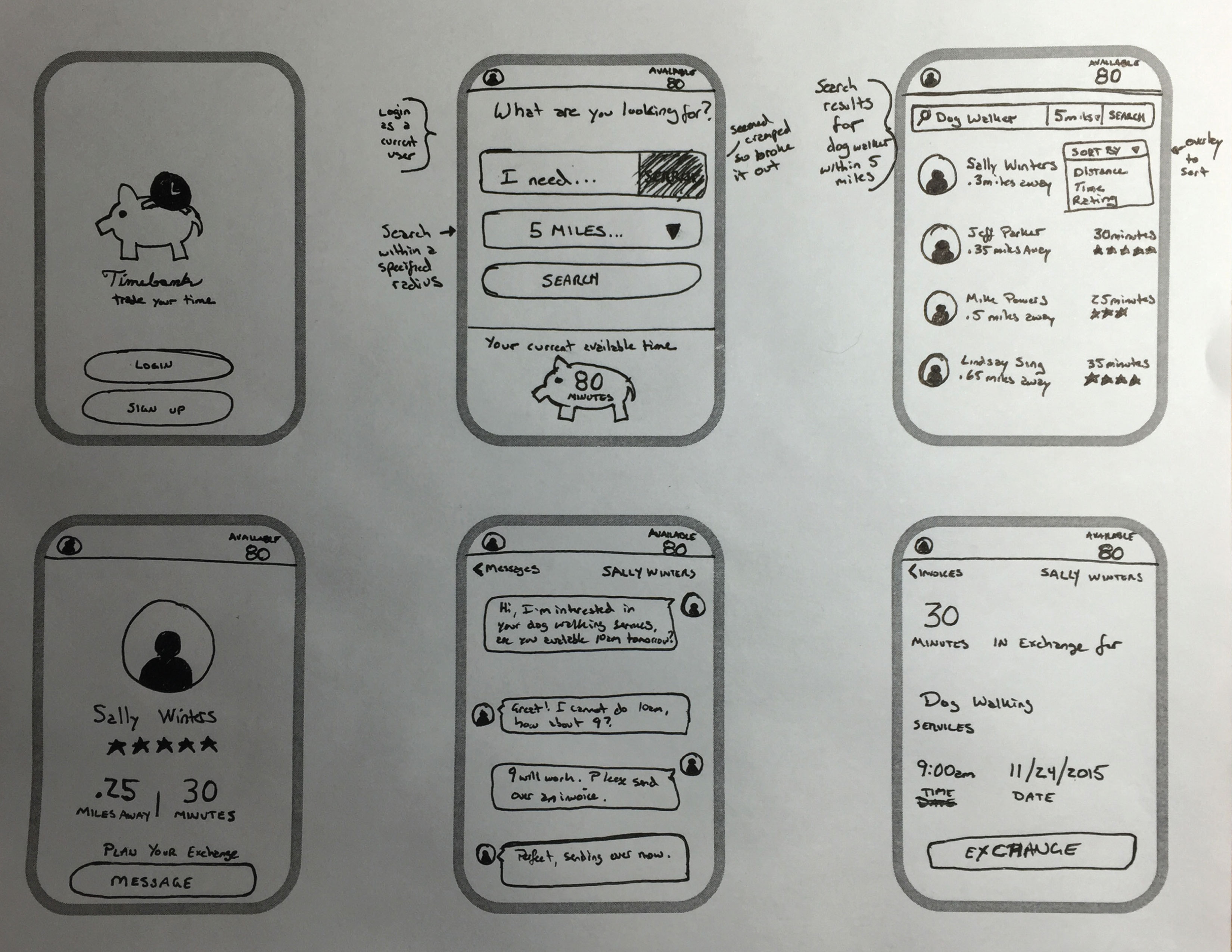
3. Page 3: A multiple screen sequence (flow) that highlights discoverability and the gulf of execution.

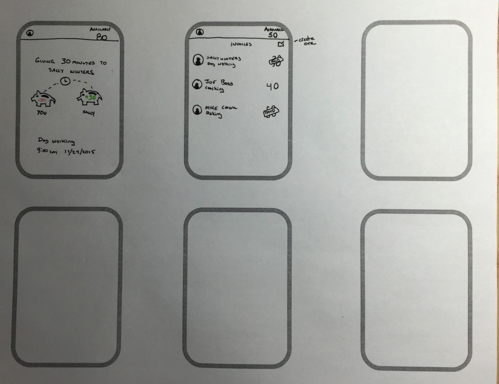
4. Page 4: A multiple screen sequence (flow) tha show how an exchange with an other member is initiatewd and the user understands action through feedback.

5. Page 5: A summary of what you learned by evaluating your designs with others.

TimeBankProject-Udacity – View Full Size

TimeBankProject-Udacity-1

TimeBankProject-Udacity-2

TimeBankProject-Udacity-3

Section 1 Project: User Goals and Business Goals

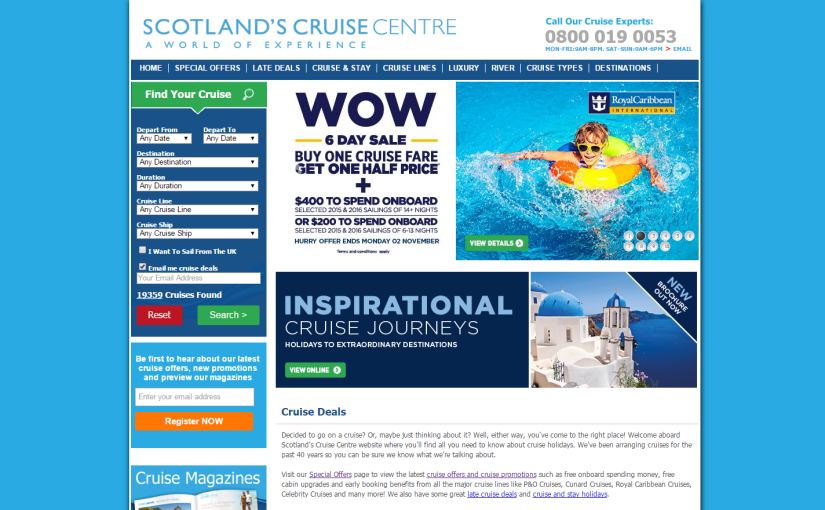
The website I chose to redesign is: Scotland’s Cruise Centre.

Objective

1. Write down the user goals and business goals for the website.

2. Based on this unit’s course material and any outside knowledge, list out the UX principles you want to focus on specifically for this site redesign.

User goals and business goals for Scotland’s Cruise Centre.

User Goals

Primary User Goal:

I want to learn more about this cruise’s departures, what’s included in the package, cruise ship amenities, and the ports we stop at to determine whether it fits my budget, needs and preferences.

Secondary User Goal:

I want to purchase this cruise.

Business Goals

Primary Business Goal:

Ability for visitors to book cruises and packages directly on the site.

Secondary Business Goal:

Increase upgraded packages sold by  10%.

UX principles to focus on for the site redesign.

Digestibility

The site is very busy and often find it hard to focus on one specific thing. Organizing with some hierarchy might be able to help highlight the more common choices or packages they want to sell.

Discoverability

Ability for users to easily discover new cruises and deals to specific destinations.

Efficiency

Users cannot currently book online. They can either fill out a form to request an inquiry or fill out a form to request a call back. I wonder how many lost sales this process results in.

Delight

The site just feels overwhelming. If I were looking at potentially booking a cruise package and came across this site I would leave before I even began exploring the options. The fact that you cannot book online is negative as well. Would like to create a more delightful browsing/shopping experience and make better use of photography to really capture the visitors attention and make them feel like they want to be there.